Publications
2021
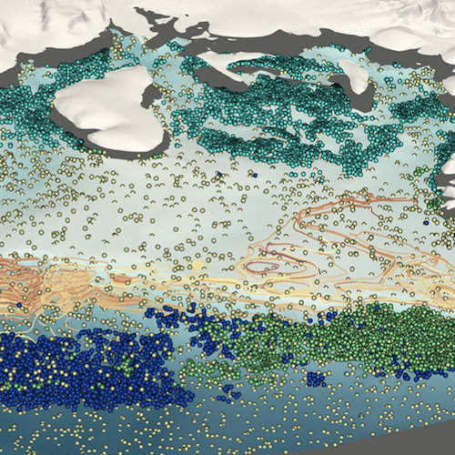
Antarctic Water Masses and Ice Shelves: Visualizing the Physics [ Journal Article ] [ Cite This ]
Abram, Greg; Petersen, Mark; Samsel, Francesca; Asay-Davis, Xylar; Comeau, Darin; Price, Stephen
2021, IEEE CG&A.
High-resolution simulation of global climate physics enables us to model how the climate may change under a variety of future scenarios. Such simulations produce vast amounts of information and dense datasets. If interrogated in tandem, these datasets can provide holistic, vital information on Earth’s many integrated systems by revealing the manifold interrelated properties of the atmosphere, ocean, and polar ice, framed by real-world terrain in 3D space as they vary over time. To accomplish this, climate scientists have joined with computer scientists and an artist to develop techniques enabling scientists to see these relationships. The impact of ocean water properties on Antarctic ice shelves illustrates the benefit of this analysis in understanding land ice melt rates and thus sea level rise.
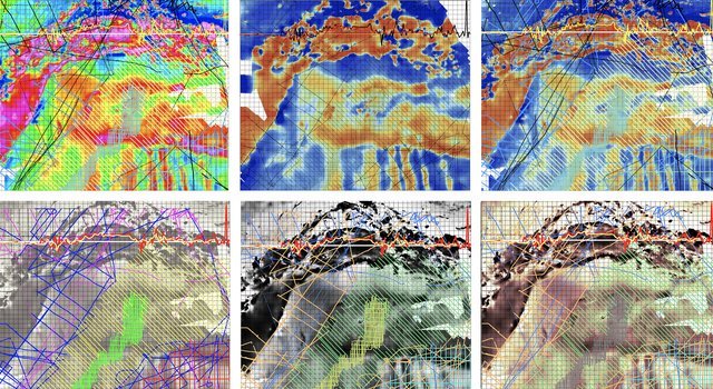
Enabling Crosscutting Visualization for Geoscience [ Journal Article ] [ Cite This ]
Szafir, Danielle; Samsel, Francesca; Zeller, Stephanie; Saltus, Rick
2021, IEEE CG&A.
Our world is a complex ecosystem of interdependent processes. Geoscientists collectindividual datasets addressing hyperspecific questions which seek to probe these deeplyintertwined processes. Scientists are beginning to explore how investigating relationshipsbetweendisciplines can foster richer and more holistic research, but visualization tools areconventionally designed to address hyperspecific, rather than holistic, analysis. Bridging thevast wealth of available data will require new tools. Visualization has the potential to supportholistic crossdisciplinary analysis to understand the complex innerworkings of our world, butdoing so requires a paradigm shift to understand how visualization might enable lines of inquirytranscending traditional disciplinary boundaries. We present challenges for visualization infostering such holistic geoscience analyses.
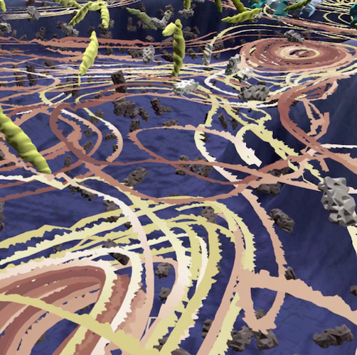
From Human Hands [ Journal Article ] [ Cite This ]
Singh, Gary
2021, IEEE CG&A.
Should visualization look natural and not sterile? Should it source material from human hands, or only from software? Just ask Dan Keefe, whose research with Artifact-Based Rendering demonstrates that the fine arts can augment scientific visualization. Keefe currently teaches in the Department of Computer Science and Engineering, University of Minnesota, where he directs the Interactive Visualization Lab. Having grown up with visual art, Keefe studied both computer engineering and oil painting in college. A summer internship at NASA Langley’s data animation and visualization lab blew his mind, setting him on a path to combine the technical with the artistic. He even went to grad school at Brown University so he could collaborate with artists and illustrators at the nearby Rhode Island School of Design. All of which surfaces in Artifact-Based Rendering, a framework that leverages the visual languages of traditional fine arts, or even nature, as input for the digital visualization pipeline. With artists helping design the visual language used to represent data, a more natural result emerges.
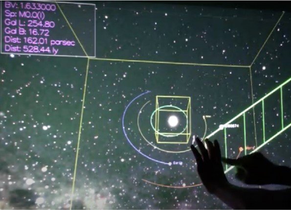
The State of the Art of Spatial Interfaces for 3D Visualization [ Journal Article ] [ Cite This ]
Besançon, Lonni; Ynnerman, Anders; Keefe, Daniel F.; Yu, Lingyun; Isenberg, Tobias
2021, Computer Graphics Forum.
We survey the state of the art of spatial interfaces for 3D visualization. Interaction techniques are crucial to data visualization processes and the visualization research community has been calling for more research on interaction for years. Yet, research papers focusing on interaction techniques, in particular for 3D visualization purposes, are not always published in visualization venues, sometimes making it challenging to synthesize the latest interaction and visualization results. We therefore introduce a taxonomy of interaction technique for 3D visualization. The taxonomy is organized along two axes: the primary source of input on the one hand and the visualization task they support on the other hand. Surveying the state of the art allows us to highlight specific challenges and missed opportunities for research in 3D visualization. In particular, we call for additional research in: (1) controlling 3D visualization widgets to help scientists better understand their data, (2) 3D interaction techniques for dissemination, which are under-explored yet show great promise for helping museum and science centers in their mission to share recent knowledge, and (3) developing new measures that move beyond traditional time and errors metrics for evaluating visualizations that include spatial interaction.
- doi: 10.1111/cgf.14189
2020
Toward an Improved Colormapping Workflow: New Task-Driven Tools and Techniques for High-Level Colormapping Applications in Scientific Visualization [ Presentation ]
Zeller, Stephanie; Samsel, Francesca;
2020, AGU.
Color, a nearly ubiquitous encoder for scientific visualizations across disciplines with robust range and versatility, often remains constrained to narrow hue, luminance, and saturation ranges within the scientific community. Despite significant work in perceptual literature on more effective uses of colormapping, difficulties persist in bridging research and practice. Obstacles impeding the adoption of modern color tools by domain scientists include scarcities of convenient and user-friendly color mapping resources, of available expertise and guidance, of precedents within the community, and of time available to researchers to familiarize themselves with new color conventions. In order to address these challenges, we present a suite of tools allowing scientists to rapidly and intuitively construct data-driven colormaps for their individual needs. These tools include a newly updated task-driven website interface, Sciviscolor, with paired comprehensive color tutorials; a searchable database by task, usage, luminance and hue range of designer-crafted linear colormaps; and a new, integrated interface within the Colormoves web-based software for automated construction of "wave" colormaps (colormaps with multiple luminance ranges across hues) based on a set of user-selected parameters. We are also working to facilitate a Colormoves—Paraview integration, which would allow for a more seamless workflow from colormap creation to application on data.
Human Fingerprints and Artistic Vocabulary; Rendering Data, Creating Engagement, Connection and Context to Earth System Models [ Presentation ]
Samsel, Francesca; Keefe, Daniel; Herman, Bridger; Abram, Gregory
2020, AGU.
Artists delve into complex themes via a visual language honed over time and refined through experimentation, iteration, and revision. In the course of these processes artists leave their signatures, signatures of our humanity: fingerprints, brushstrokes, embodied gestures, and the footprints of our thought processes. These signatures provide context, historical, cultural and individual. For work on the boundary of art and science it is these signatures that remind us that behind the work, both the art and science, is another person sorting through the same experiences of our time, seeking to understand and make peace with internal and external incongruence.
Dietmar Offenhuber: Collaboration Via the Many Traces Our Data Sets Leave Behind [ Journal Article ] [ Cite This ]
Offenhuber, Deitmar; Campbell, Bruce; Samsel, Francesca
2020, IEEE CG&A.
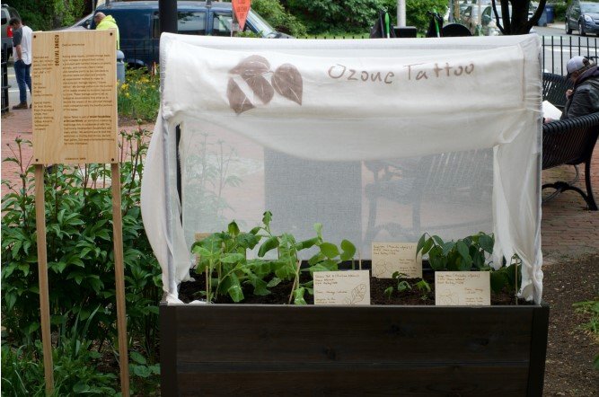
We asked Dietmar Offenhuber for an interview upon investigating his recent works, Staubmarke (Dust mark) and Ozone Tattoo, which together suggest an artist with an insightful eye for injecting particulate data engagingly into art pieces that spur awareness in an audience. We were impressed by his deep considerations on the potential for scientific and informatics data sets to offer the potential for, and foster, wider discussions and collaborations.
Close Reading for Visualization Evaluation [ Journal Article ] [ Cite This ]
Bares, Annie; Keefe, Daniel F.; Samsel, Francesca; Rhyne, Theresa-Marie
2020, IEEE CG&A.
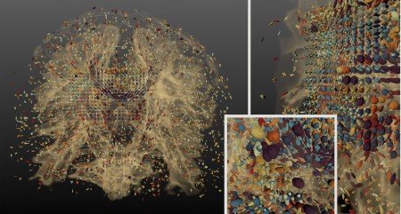
Visualizations produced by collaborations between artists, scientists, and visualization experts lay claim to being not only more effective in delivering information but also more effective in their abilities to elicit qualities like human connection. However, as prior work in the visualization community has demonstrated, it is difficult to evaluate these claims because characteristics associated with human connection are not easily measured quantitatively. In this Visualization Viewpoints piece, we address this problem in the context of our work to develop methods of evaluating visualizations created by Sculpting Visualization, a multidisciplinary project that incorporates art and design theory and practice into the process of scientific visualization. We present the design and results of a study in which we used close reading, a formal methodology used by humanities scholars, as a way to test reactions and analyses from evaluation participants related to an image created using Sculpting Visualization. In addition to specific suggestions about how to improve future iterations of the visualization, we discuss key findings of the evaluation related to contextual information, visual perspective, and associations that individual viewers brought to bear on their experience with the visualization.
Visualizing Science: How Color Determines What We See [ Journal Article ] [ Cite This ]
Zeller, Stephanie; Rogers, David
2020, (Published in EOS: Science News by AGU).
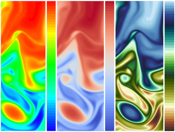
Color plays a major role in the analysis and communication of scientific information. New tools are helping to improve how color can be applied more accurately and effectively to data.
- doi: 10.1029/2020EO144330
Art and Cultural Heritage [ Journal Article ] [ Cite This ]
Rushmeier, Holly; Samsel, Francesca; Zhang, Jiawan
2020, IEEE CG&A.
Computer graphics has an application in virtually every area of human activity. In this Special Issue, we focus on applications in art and cultural heritage. For decades now graphics has played a role in the digitization, restoration, conservation, presentation, and communication of our cultural heritage as well as providing new mediums for reflecting on our culture. There continues to be a productive two-way channel between computer graphics and heritage—new graphics techniques continue to have a positive impact on the understanding and communication of heritage, and heritage applications continue to inspire new innovations in computer graphics. In this issue, we present four papers that illustrate the broad range of productive interactions between these fields.
Printmaking, Puzzles, and Studio Closets: Using Artistic Metaphorsto Reimagine the User Interface for Designing Immersive Visualizations [ Journal Article ]
Herman, Bridger; Samsel, Francesca; Bares, Annie; Johnson, Seth; Abram, Gregory; Keefe, Daniel
2020, IEEE VISAP.
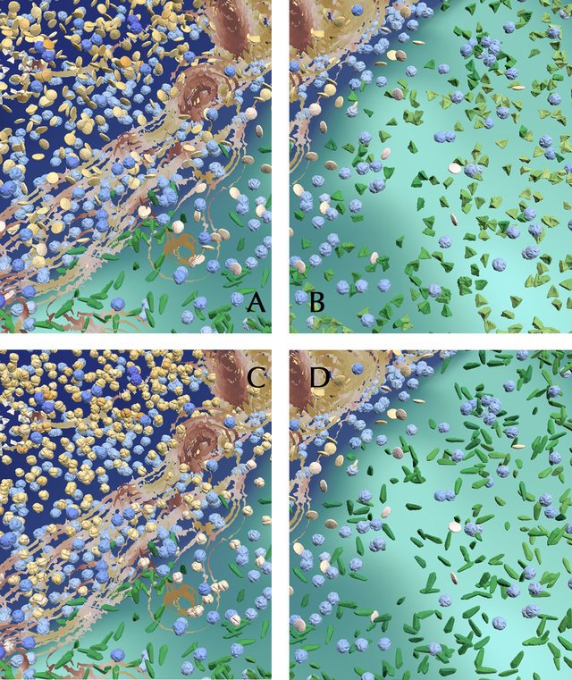
We, as a society, need artists to help us interpret and explain science, but what does an artist's studio look like when today's science is built upon the language of large, increasingly complex data? This paper presents a data visualization design interface that lifts the barriers for artists to engage with actively studied, 3D multivariate datasets. To accomplish this, the interface must weave together the need for creative artistic processes and the challenging constraints of real-time, data-driven 3D computer graphics. The result is an interface for a technical process, but technical in the way artistic printmaking is technical, not in the sense of computer scripting and programming. Using metaphor, computer graphics algorithms and shader program parameters are reimagined as tools in an artist's printmaking studio. These artistic metaphors and language are merged with a puzzle-piece approach to visual programming and matching iconography. Finally, artists access the interface using a web browser, making it possible to design immersive multivariate data visualizations that can be displayed in VR and AR environments using familiar drawing tablets and touch screens. We report on insights from the interdisciplinary design of the interface and early feedback from artists
Using Close Reading as a Method for Evaluating Visualizations [ Conference Paper ] [ Cite This ]
Bares, Annie; Zeller, Stephanie; Jackson, Cullen; Keefe, Daniel; Samsel, Francesca
2020, IEEE VIS.
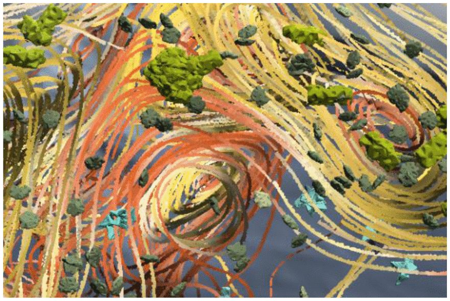
Visualization research and practice that incorporates the arts make claims to being more effective in connecting with users on a human level. However, these claims are difficult to measure quantitatively. In this paper, we present a follow-on study to use close reading, a humanities method from literary studies, to evaluate visualizations created using artistic processes [Bares 2020]. Close reading is a method in literary studies that we’ve previously explored as a method for evaluating visualizations. To use close reading as an evaluation method, we guide participants through a series of steps designed to prompt them to interpret the visualization’s formal, informational, and contextual features. Here we elaborate on our motivations for using close reading as a method to evaluate visualizations, and enumerate the procedures we used in the study to evaluate a 2D visualization, including modifications made because of the COVID-19 pandemic. Key findings of this study include that close reading is an effective formative method to elicit information related to interpretation and critique; user subject position; and suspicion or skepticism. Information gained through close reading is valuable in the visualization design and iteration processes, both related to designing features and other formal elements more effectively, as well as in considering larger questions of context and framing.
Environmental Visualization: Moving Beyond the Rainbows [ Conference Paper ] [ Cite This ]
Stephanie Zeller, Francesca Samsel, and Paul Navártil. 2020.
Practice and Experience in Advanced Research Computing (PEARC '20). Association for Computing Machinery, New York, NY, USA, 321–326.
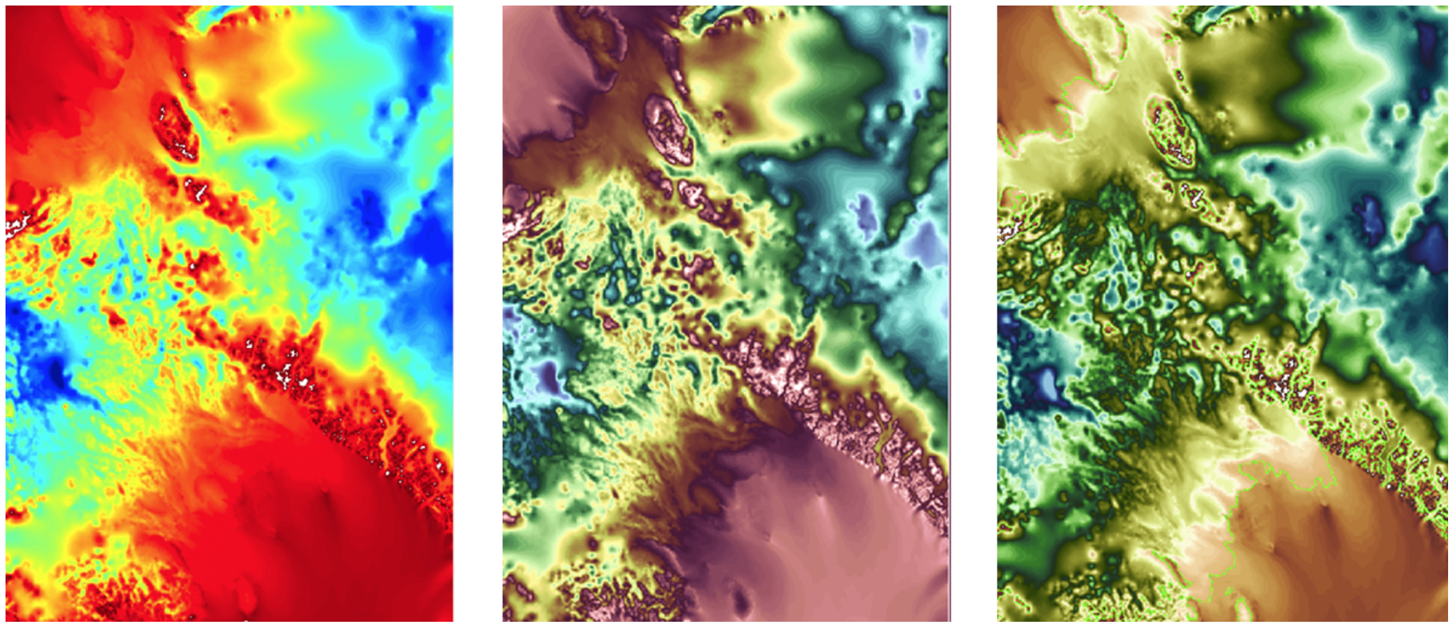
Pseudo-coloring is a well-established, fundamental tool for visualizing scientific data. As the size and density of data grows, increasingly more discriminatory power is required to extract optimum feature resolution. The environmental community, in particular, relies heavily on this technology to dissect and interpret a huge variety of visual data. These scientists often turn to traditional rainbow colormaps, despite their well-documented deficiencies in rendering dense detail. A popular default, the desaturated rainbow’s non-monotonically varying luminance range misrepresents data. Despite increasing overall feature resolution, this variance creates hue simultaneity and vibration, introducing false artifacts, hindering exploration of swaths of data and impeding analysis [13, 21, 26]. Drawing on artistic color theory, we hypothesized the desaturated rainbow could be improved by increasing luminance ranges, decreasing saturation, and employing hue-cycling to boost discriminatory power. These adjusted maps exhibit algorithmically corroborated higher feature resolve, a primary objective of all scientists interviewed, without distorting data in discordant false coloring. Our studies indicate that our maps are preferred by these domain scientists, thereby providing a potential alternative for effective, human-centric colormapping.
2019
Colormapping resources and strategies for organized intuitive environmental visualization [ Journal Article ]
Samsel, Francesca; Wolfram, Phillip; Bares, Annie; Turton, Terece; Bujack, Roxana
Environmental Earth Sciences, 78 (9), pp. 269, 2019, ISSN: 1866-6280, (LA-UR-19-20060).
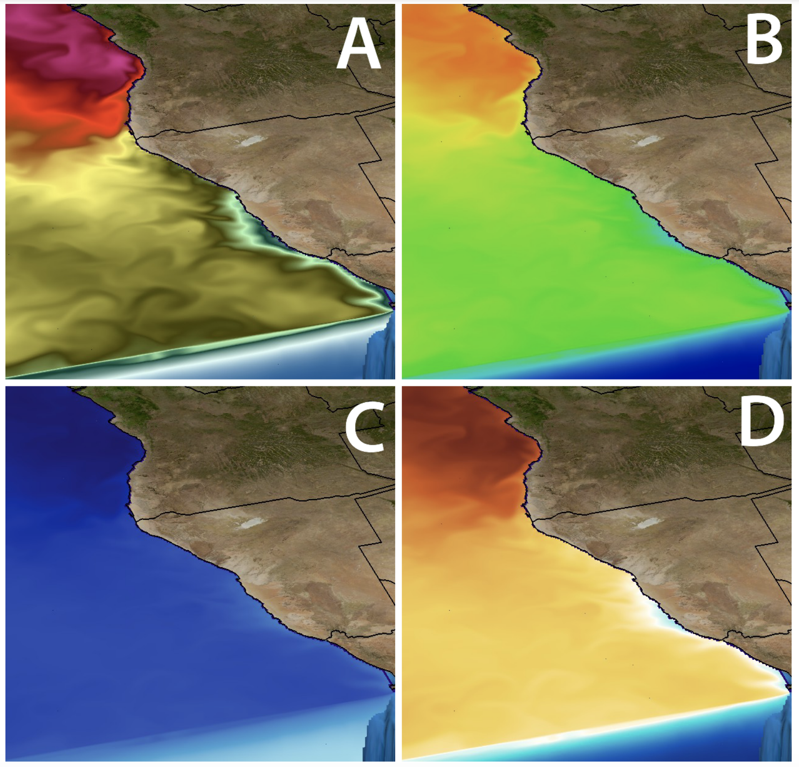
Visualizations benefit from the use of intuitive organized color application, enabling a clearer understanding and communication. In this paper, we apply the concept of semantic color association to the generation of thematic colormaps for the environmental sciences in combination with principals of artistic color theory to expand feature resolution and create visual hierarchies within a visualization. In particular, we provide sets of color scales, colormaps and color organization guidance for semantically aligned water, atmosphere, land, and vegetation visualization. Strategies for directing attention via saturation levels and saturation sets of colormaps enable deployment of these techniques. All are publicly available online and accompanied by tools and strategy guidance.
The Making of Continuous Colormaps [ Journal Article ]
Nardini, Pascal; Chen, Min; Samsel, Francesca; Bujack, Roxana
2020, IEEE Transactions on Visualization and Computer Graphics PP(99):1-1
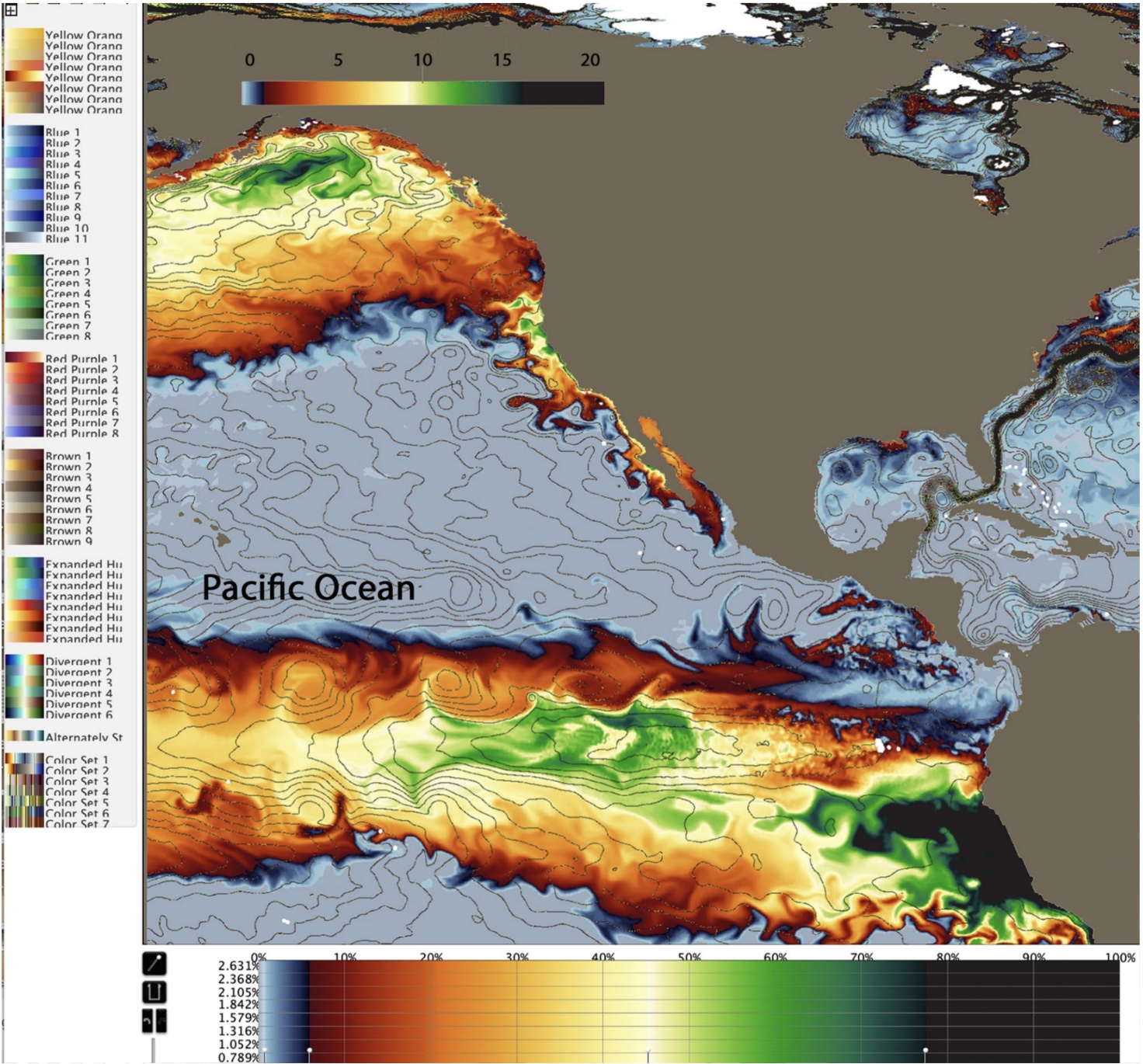
Continuous colormaps are integral parts of many visualization techniques, such as heat-maps, surface plots, and flow visualization. Despite that the critiques of rainbow colormaps have been around and well-acknowledged for three decades, rainbow colormaps are still widely used today. One reason behind the resilience of rainbow colormaps is the lack of tools for users to create a continuous colormap that encodes semantics specific to the application concerned. In this paper, we present a web-based software system, CCC-Tool (short for Charting Continuous Colormaps) under the URL https://ccctool.com, for creating, editing, and analyzing such application-specific colormaps. We introduce the notion of "colormap specification (CMS)" that maintains the essential semantics required for defining a color mapping scheme. We provide users with a set of advanced utilities for constructing CMS's with various levels of complexity, examining their quality attributes using different plots, and exporting them to external application software. We present two case studies, demonstrating that the CCC-tool can help domain scientists as well as visualization experts in designing semantically-rich colormaps.
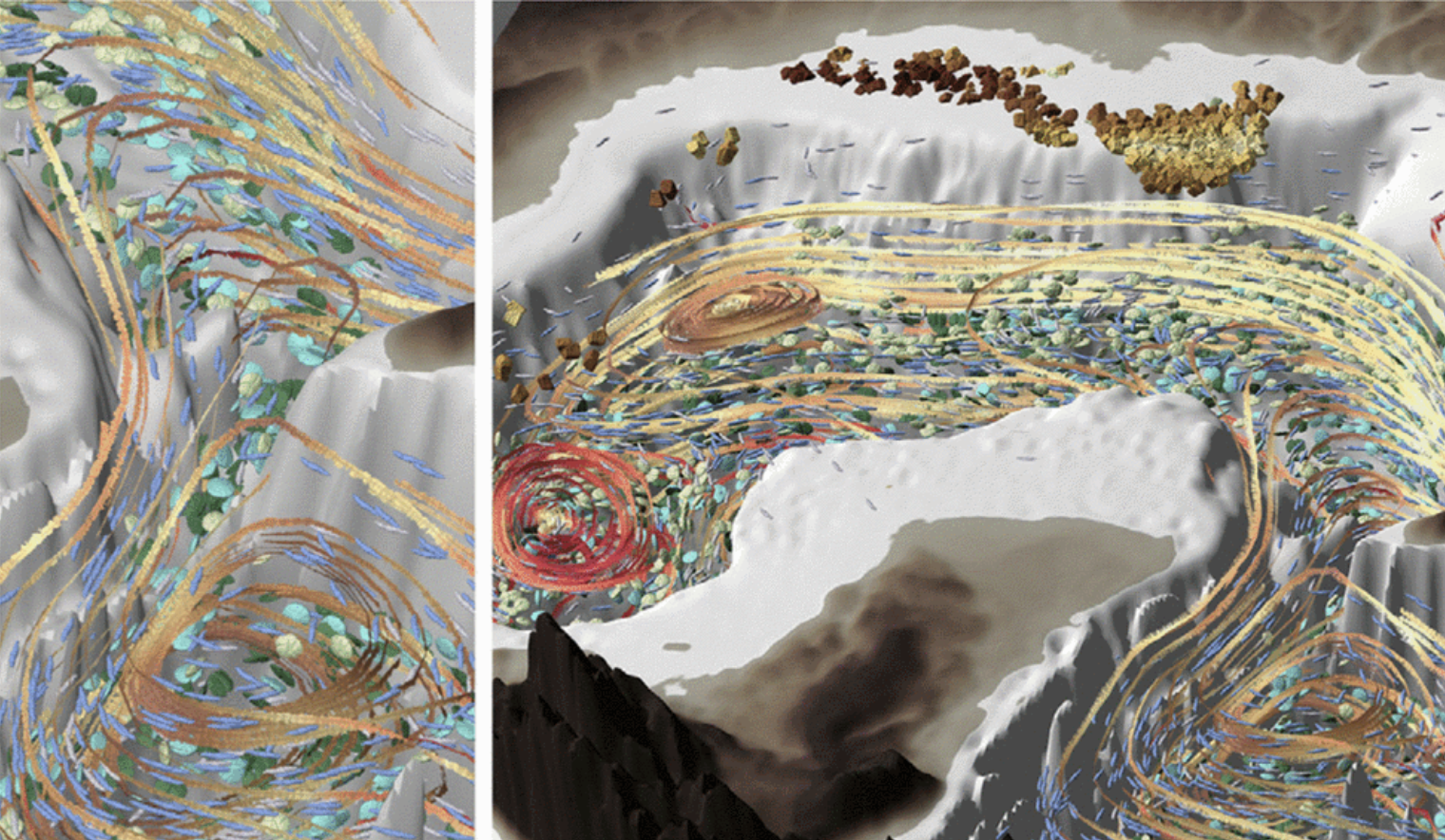
Artifact-Based Rendering: Harnessing Natural and Traditional Visual Media for More Expressive and Engaging 3D Visualizations [ Journal Article ]
Johnson, Seth; Samsel, Francesca; Abram, Gregory; Olson, Daniel; Solis, Andrew; Herman, Bridger; Wolfram, Philip; Lenglet, Christoph; Keefe, Daniel
2019, IEEE Transactions on Visualization and Computer Graphics
We introduce Artifact-Based Rendering (ABR), a framework of tools, algorithms, and processes that makes it possible to produce real, data-driven 3D scientific visualizations with a visual language derived entirely from colors, lines, textures, and forms created using traditional physical media or found in nature. A theory and process for ABR is presented to address three current needs: (i) designing better visualizations by making it possible for non-programmers to rapidly design and critique many alternative data-to-visual mappings; (ii) expanding the visual vocabulary used in scientific visualizations to depict increasingly complex multivariate data; (iii) bringing a more engaging, natural, and human-relatable handcrafted aesthetic to data visualization. New tools and algorithms to support ABR include front-end applets for constructing artifact-based colormaps, optimizing 3D scanned meshes for use in data visualization, and synthesizing textures from artifacts. These are complemented by an interactive rendering engine with custom algorithms and interfaces that demonstrate multiple new visual styles for depicting point, line, surface, and volume data. A within-the-research-team design study provides early evidence of the shift in visualization design processes that ABR is believed to enable when compared to traditional scientific visualization systems. Qualitative user feedback on applications to climate science and brain imaging support the utility of ABR for scientific discovery and public communication.
2018
ColorMoves: a graphics tool to explore scientific data in an artistic way [ Miscellaneous ]
Cameron, Lori
2018.
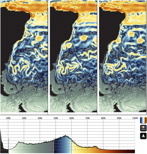
ColorMoves: Real-time Interactive Colormap Construction for Scientific Visualization [ Journal Article ]
Samsel, Francesca; Klaassen, Sebastion; Rogers, David
2018, (LA-UR-17-29913).
The visualization of scientific data is both a science and an art, in which many tools are used to explore, discover and communicate the information within the data. This process is increasingly difficult, as the size and complexity of data is constantly advancing. Color is a potent tool in scientific data visualization, and has been well studied. However, color’s full potential for communication and discovery remains untapped. Effective use of color requires a depth of understanding and experience employing color and color relationships, in combination with tools to translate that knowledge into scientific visualization workflows. In this paper, we present ColorMoves, an interactive tool that promotes exploration of scientific data through artist-driven color methods in a unique and transformative way. We discuss the power of contrast in scientific visualization, the design of the ColorMoves tool, and the tool’s application in several science domains.
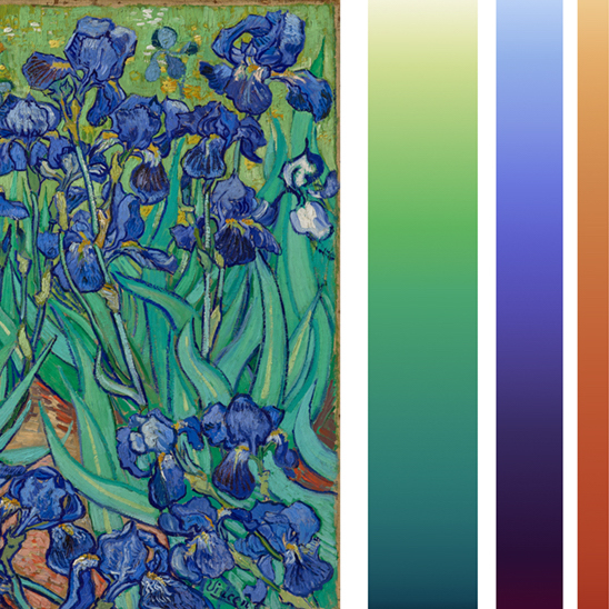
Art, Affect and Color: Creating Engaging Expressive Scientific Visualization [ Inproceedings ]
Samsel, Francesca; Bartram, Lyn; Annie, Bares
In proceedings IEEE Visualization 2018, 2018.
2017
Employing Color Theory to Visualize Volume-rendered Multivariate Ensembles of Asteroid Impact Simulations [ Inproceedings ]
Samsel, Francesca; Patchett, John; Rogers, David; Tsai, Karen
Proceedings of the 2016 CHI Conference Extended Abstracts on Human Factors in Computing Systems, pp. 1126-1134, ACM, 2017, ISBN: 978-1-4503-4656-6, (LA-UR-17-20419).
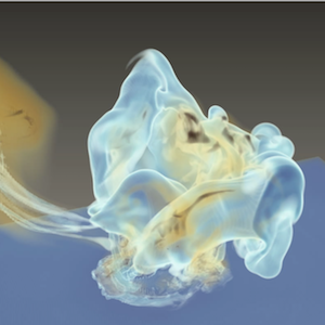
We describe explorations and innovations developed to help scientists understand an ensemble of large scale simulations of asteroid impacts in the ocean. The simulations were run to help scientists determine the characteristics of asteroids that NASA should track, so that communities at risk from impact can be given advanced notice. Of relevance to the CHI community are 1) hands-on workflow issues specific to exploring ensembles of large scientific data, 2) innovations in exploring such data ensembles with color, and 3) examples of multidisciplinary collaboration.
Intuitive Colormaps for Environmental Visualization [ Inproceedings ]
Samsel, Francesca; Turton, Terece; Wolfram, Phillip; Bujack, Roxana
Rink, Karsten; Middel, Ariane; Zeckzer, Dirk; Bujack, Roxana (Ed.): Workshop on Visualisation in Environmental Sciences (EnvirVis), The Eurographics Association, 2017, ISBN: 978-3-03868-040-6, (LA-UR-17-22224).
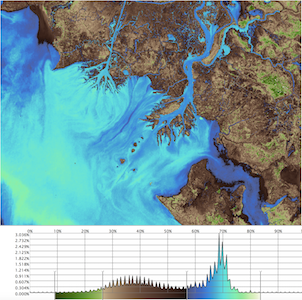
Visualizations benefit from the use of intuitive colors, enabling an observer to make use of more automatic, subconscious channels. In this paper, we apply the concept of intuitive color to the generation of thematic colormaps for the environmental sciences. In particular, we provide custom sets of colormaps for water, atmosphere, land, and vegetation. These have been integrated into the online tool: ColorMoves: The Environment to enable the environmental scientist to tailor them precisely to the data and tasks in a simple drag-and-drop workflow.
The Good, the Bad, and the Ugly: A Theoretical Framework for the Assessment of Continuous Colormaps [ Inproceedings ]
Bujack, Roxana; Turton, Terece; Samsel, Francesca; Ware, Colin; Rogers, David; Ahrens, James
IEEE Visualization, 2017.
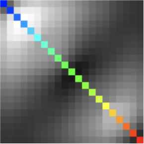
A myriad of design rules for what constitutes a “good” colormap can be found in the literature. Some common rules include order, uniformity, and high discriminative power. However, the meaning of many of these terms is often ambiguous or open to interpretation. At times, different authors may use the same term to describe different concepts or the same rule is described by varying nomenclature. These ambiguities stand in the way of collaborative work, the design of experiments to assess the characteristics of colormaps, and automated colormap generation.
In this paper, we review current and historical guidelines for colormap design. We propose a specified taxonomy and provide unambiguous mathematical definitions for the most common design rules.
A Crowdsourced Approach to Colormap Assessment [ Inproceedings ]
Turton, Terece; Ware, Colin; Samsel, Francesca; Rogers, David
Lawonn, Kai; Smit, Noeska; Cunningham, Douglas (Ed.): EuroVis Workshop on Reproducibility, Verification, and Validation in Visualization (EuroRV3), The Eurographics Association, 2017, ISBN: 978-3-03868-041-3.
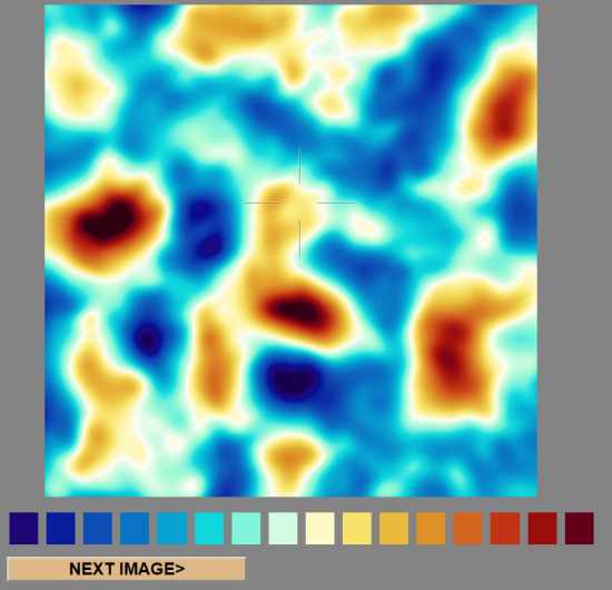
Despite continual research and discussion on the perceptual effects of color in scientific visualization, psychophysical testing is often limited. In-person lab studies can be expensive and time-consuming while results can be difficult to extrapolate from meticulously controlled laboratory conditions to the real world of the visualization user. We draw on lessons learned from the use of crowdsourced participant pools in the behavioral sciences and information visualization to apply a crowdsourced approach to a classic psychophysical experiment assessing the ability of a colormap to impart metric information. We use an online presentation analogous to the color key task from Ware’s 1988 paper, Color Sequences for Univariate Maps, testing colormaps similar to those in the original paper along with contemporary colormap standards and new alternatives in the scientific visualization domain. We explore the issue of potential contamination from color deficient participants and establish that perceptual color research can appropriately leverage a crowdsourced participant pool without significant CVD concerns. The updated version of the Ware color key task also provides a method to assess and compare colormaps.
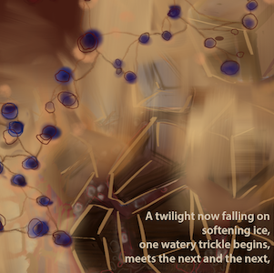
Arctic Messages: Arctic research in the Vocabulary of Poets and Artists [ Presentation ]
Samsel, Francesca
01.01.2017.
Arctic Messages is a multidisciplinary work designed to encourage dialogue on the changing Arctic ecosystems and ramifications on global societies. Driven by the desire to provide avenues into the science and impacts of the changing Arctic tundra, our team comprised of Arctic researcher, a poet, a visual artist and visualization experts set out to create a blended language able to speak to the general public. Arctic Messages is one facet of our broader effort - experimentation of communication mediums able to engage viewers and raise awareness of the Arctic and its impact on global weather patterns. The work centers on the belief that facts alone have not served us well in broadening interest and dialogue. We are seeking to craft a blended language that speaks to our humanity as well as our intellect.
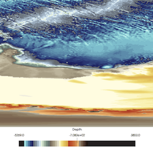
ColorMoves: Optimizing Color's Potential for Exploration and Communication of Data [ Presentation ]
Samsel, Francesca
01.01.2017.
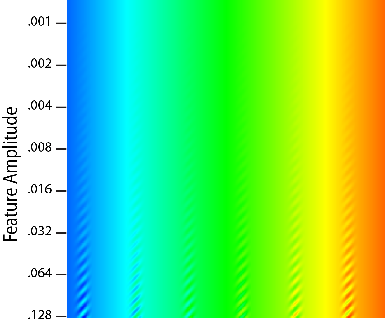
Evaluating the Perceptual Uniformity of Color Sequences for Feature Discrimination [ Inproceedings ]
Ware, Colin; Turton, Terece; Samsel, Francesca; Bujack, Roxana; Rogers, David
Lawonn, Kai; Smit, Noeska; Cunningham, Douglas (Ed.): EuroVis Workshop on Reproducibility, Verification, and Validation in Visualization (EuroRV3), The Eurographics Association, 2017, ISBN: 978-3-03868-041-3, (LA-UR-17-24206).
Probably the most common method for visualizing univariate data maps is through pseudocoloring and one of the most commonly cited requirements of a good colormap is that it be perceptually uniform. This means that differences between adjacent colors in the sequence be equally distinct. The practical value of uniformity is for features in the data to be equally distinctive no matter where they lie in the colormap, but there are reasons for thinking that uniformity in terms of feature detection may not be achieved by current methods which are based on the use of uniform color spaces. In this paper we provide a new method for directly evaluating colormaps in terms of their capacity for feature resolution. We apply the method in a study using Amazon Mechanical Turk to evaluate seven colormaps. Among other findings the results show that two new double ended sequences have the highest discriminative power and good uniformity. Ways in which the technique can be applied include the design of colormaps for uniformity, and a method for evaluating colormaps through feature discrimination curves for differently sized features.
2016
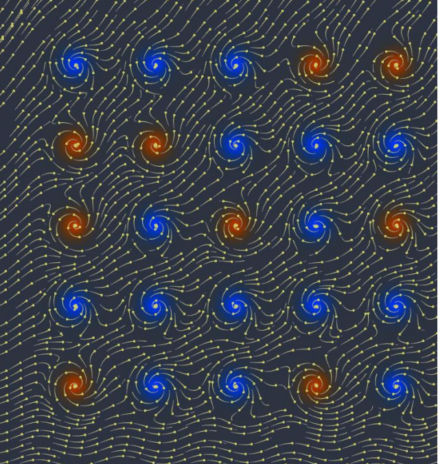
Optimizing for Visual Cognition in High Performance Scientific Computing [ Journal Article ]
Ware, Colin; Rogers, David; Petersen, Mark; Ahrens, James; Aygar, Erol
Electronic Imaging, 2016 (16), pp. 1–9, 2016, ISSN: 2470-1173.
High performance scientific computing is undergoing radical changes as we move to Exascale (1018 FLOPS) and as a consequence products for visualization must increasingly be generated in-situ as opposed to after a model run. This changes both the nature of the data products and the overall cognitive work flow. Currently, data is saved in the form of model dumps, but these are both extremely large and not ideal for visualization. Instead, we need methods for saving model data in ways that are both compact and optimized for visualization. For example, our results show that animated representations are more perceptually efficient than static views even for steady flows, so we need ways of compressing vector field data for animated visualization. Another example, motion parallax is essential to perceive structures in dark matter simulations, so we need ways of saving large particle systems optimized for perception. Turning to the cognitive work flow, when scientists and engineers allocate their time to high performance computer simulations their effort is distributed between pre and post run work. To better understand the tradeoffs we created an analytics game to model the optimization of high performance computer codes simulating ocean dynamics. Visualization is a key part of this process. The results from two analytics game experiments suggest that simple changes can have a large impact on overall cognitive efficiency. Our first experiment showed that study participants continued to look at images for much longer than optimal. A second experiment revealed a large reduction in cognitive efficiency as working memory demands increased. We conclude with recommendations for systems design.
Discovery Jam: An IEEE Vis 2017 Workshop Proposal [ Inproceedings ]
Rogers, David; Aragon, Celia; Keefe, Dan; Meyer, Miriah; Samsel, Francesca
2016, (LA-UR-16-23006).
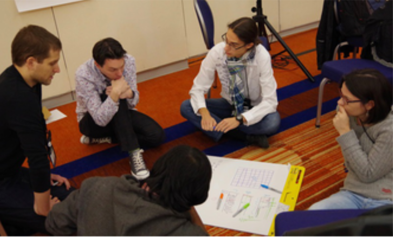
It is clear that modern scientific discovery requires a new data-intensive approach. Vast stores of data available - from experiments, observations and simulations - may enable countless new discoveries, yet scientists continue to struggle to make sense of their data. Like many IEEE VIS attendees, we believe visualization holds an answer to this problem, but we also believe that a new, perhaps even disruptive, approach is needed in order to realize this potential. Building on the success of our team’s halfday workshop at VisWeek 2016, we propose a full-day Discovery Jam workshop that includes a hands-on data hack-a-thon in collaboration with domain scientists. The Discovery Jam demonstrates - through example - a culture of collaboration and training a new cohort of scientists, technologists, and artists to work together toward discovery across disciplines. The Discovery Jam will bring scientists to VisWeek, to present their difficult, high-impact science discovery problems to experts in the vis community. The results from the workshop will be added to the online online community being hosted at http://www.discoveryjam.com.
Visualization and Analysis of Threats from Asteroid Ocean Impacts [ Inproceedings ]
Patchett, John; Samsel, Francesca; Tsai, Karen; Gisler, Galen; Rogers, David; Abram, Greg; Turton, Terece
2016, (Winner, Best Scientific Visualization and Data Analytics Showcase; LA-UR-16-26258).
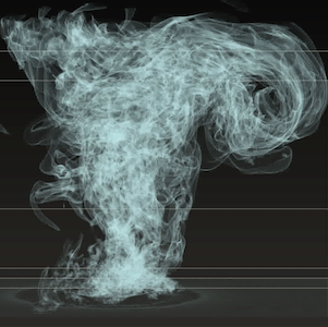
An asteroid colliding with earth can have grave consequences. An impact in the ocean has complex effects as the kinetic energy of the asteroid is transferred to the water, potentially causing a tsunami or other distant effect. Scientists at Los Alamos National Laboratory are using the xRage simulation code on high performance computing (HPC) systems to understand the range of possible behaviors of an asteroid impacting the ocean. By running ensembles of large scale 3D simulations, scientists can study a set of potential factors for asteroid-generated tsunamis (AGTs) such as angle of impact, asteroid mass and air burst elevation. These studies help scientists understand the consequences of asteroid impacts such as water dispersement into the atmosphere, which can impact the global climate, or tsunami creation, which can place population centers at risk. The results of these simulations will support NASA’s Office of Planetary Defense in deciding how to best track near-Earth objects (NEOs).
Interactive Colormapping: Enabling Multiple Data Ranges, Detailed Views of Ocean Salinity [ Inproceedings ]
Samsel, Francesca; Klassen, Sebastian; Petersen, Mark; Turton, Terece; Abram, Greg; Rogers, David; Ahrens, James
Proceedings of the 34rd Annual ACM Conference Extended Abstracts on Human Factors in Computing Systems, ACM, San Jose, California, 2016, (LA-UR-15-20105).
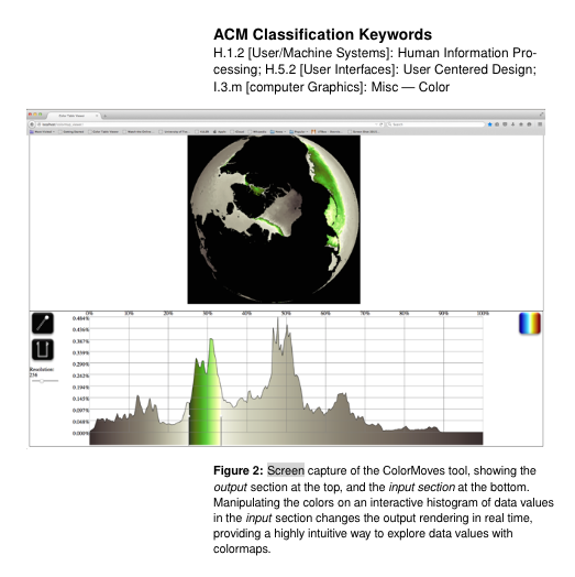
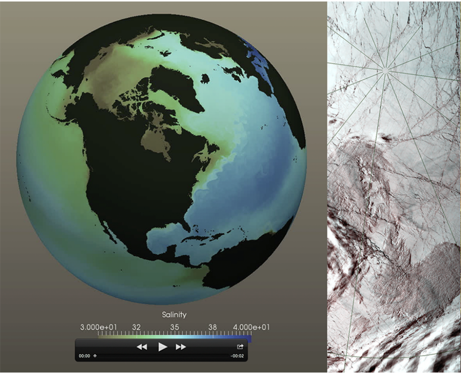
Ocean salinity is a critical component to understanding climate change. Salinity concentrations and temperature drive large ocean currents which in turn drive global weather patterns. Melting ice caps lower salinity at the poles while river deltas bring fresh water into the ocean worldwide. These processes slow ocean currents, changing weather patterns and producing extreme climate events which disproportionally affect those living in poverty. Analysis of salinity presents a unique visualization challenge. Important data are found in narrow data ranges, varying with global location. Changing values of salinity are important in understanding ocean currents, but are difficult to map to colors using traditional tools. Commonly used colormaps may not provide sufficient detail for this data. Current editing tools do not easily enable a scientist to explore the subtleties of salinity. We present a workflow, enabled by an interactive colormap tool that allows a scientist to interactively apply sophisticated colormaps to scalar data. The intuitive and immediate interaction of the scientist with the data is a critical contribution of this work.
Animated Versus Static Views of Steady Flow Patterns [ Inproceedings ]
Ware, Colin; Bolan, Daniel; Miller, Ricky; Rogers, David; Ahrens, James
Proceedings of the ACM Symposium on Applied Perception, pp. 77–84, ACM, Anaheim, California, 2016, ISBN: 978-1-4503-4383-1.
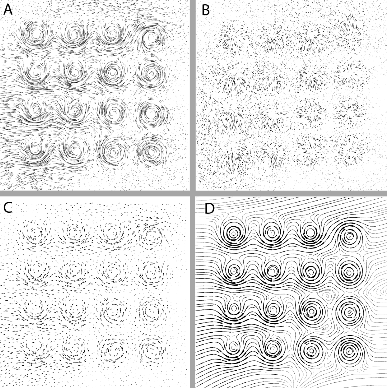
Two experiments were conducted to test the hypothesis that animated representations of vector fields are more effective than common static representations even for steady flow. We compared four flow visualization methods: animated streamlets, animated orthogonal line segments (where short lines were elongated orthogonal to the flow direction but animated in the direction of flow), static equally spaced streamlines, and static arrow grids. The first experiment involved a pattern detection task in which the participant searched for an anomalous flow pattern in a field of similar patterns. The results showed that both the animation methods produced more accurate and faster responses. The second experiment involved mentally tracing an advection path from a central dot in the flow field and marking where the path would cross the boundary of a surrounding circle. For this task the animated streamlets resulted in better performance than the other methods, but the animated orthogonal particles resulted in the worst performance. We conclude with recommendations for the representation of steady flow patterns.
2015
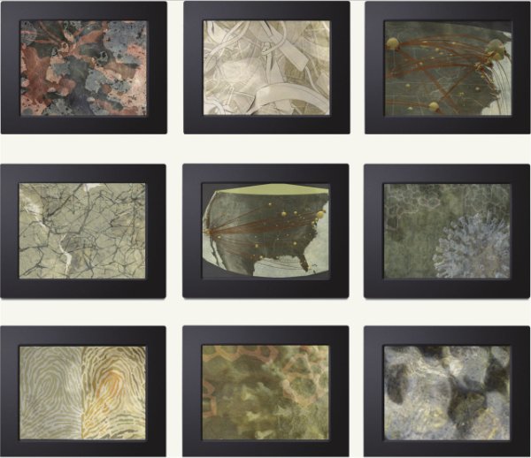
Pursuing Value in Art-Science Collaborations [ Journal Article ]
Campbell, Bruce; Samsel, Francesca
35 , pp. 6-11, 2015.
Over decades and centuries, the practices of art and science have diverged as separate disciplines and, driven by scrutiny and opinions, have sought to define what makes a great artist or scientist. It is not surprising, therefore, that many scientists remain unfamiliar with the many and varied artistic contributions to scientific advancement. Art-science case studies aren't encountered in our everyday work, but they can be highly suggestive of approaches for creative thinking and innovation. Today you can readily find scientists whose work could be shared with the general public more effectively. By introducing an Art on Graphics department to CG&A, the department editors aim to expose the work of teams that draw on the skills of art, science, and technology professions to make rigorous innovative contributions to the domain of computer graphics and applications.
Using the Arts as a Bridge to Public Understanding of Data-Intensive Earth Science Research through Climate Prisms: The Arctic [ Journal Article ]
Deck, Linda; Samsel, Francesca; Wilson, Cathy; Rodriguez-Acosta, Mireya
2015.
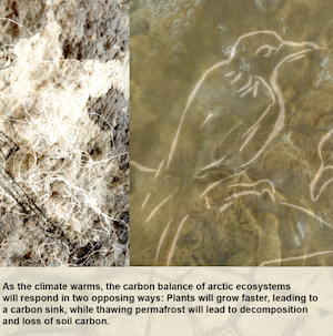
An ever-growing body of research in Informal Science Education is showing that the arts contribute greatly to engaging the free-choice science learner. This kind of learning goes on outside of the classroom, notably in science centers and museums, where novel, experiential approaches can be piloted. A new exhibit, Climate Prisms: The Arctic, is being mounted by a team of artists and scientists at the Bradbury Science Museum of Los Alamos National Laboratory. It presents the pipeline from collecting soil samples in the Arctic to analyzing them in the labs to the statistical analysis of the findings and on to the input into the climate model, using prisms of art: visual art, poetry, scientific text, information graphics, field imagery and others. The presentation encourages users to view Arctic science through these different lenses. Each person plots their own path, moving through the content at the pace and level that best enables them to engage with the material. With the entry points through multiple artistic voices, learners hearts and feelings are directly reached, building primarily affective connections and then curiosity, rather than cognitive. The project itself is a large display screen driven by a touch interface designed for individual or small group viewing. Content paths are determined by an underlying system of tags, levels, content categories and related research areas. A screen shows a set of images. Each image can be accessed to provide image-specific information or can be a launching pad for a new set of related content and images that allows the user to continue on their exploration journey. Each person, each time they visit, creates a unique path through over 2000 pieces of content according to the unique set of learning assets and interests they bring with them at that visit. Embedded assessment will log basic demographics and each individual foray through the content. These assessments will be analyzed to explore trends of use and drive further content development.
Visualization of ocean currents and eddies in a high-resolution global ocean-climate model [ Inproceedings ]
Samsel, Francesca; Petersen, Mark; Abram, Greg; Turton, Terece; Rogers, David; Ahrens, James
Proceedings of the International Conference on High Performance Computing, Networking, Storage and Analysis 2015, 2015, (LA-UR-15-20105).
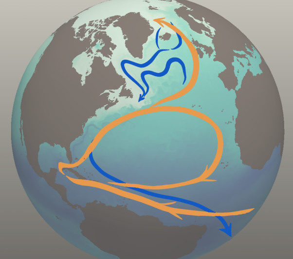
Climate change research relies on models to better understand and predict the complex, interdependent processes that affect the atmosphere, ocean, and land. These models are computationally intensive and produce terabytes to petabytes of data. Visualization and analysis is increasingly difficult, yet is critical to gain scientific insights from large simulations. The recently-developed Model for Prediction Across Scales-Ocean (MPAS-Ocean) is designed to investigate climate change at global high-resolution (5 to 10 km grid cells) on high performance computing platforms. In the accompanying video, we use state-of-the-art visualization techniques to explore the physical processes in the ocean relevant to climate change. These include heat transport, turbulence and eddies, weakening of the meridional overturning circulation, and interaction between a warming ocean and Antarctic ice shelves. The project exemplifies the benefits of tight collaboration among scientists, artists, computer scientists, and visualization specialists.
Climate Prisms: The Arctic Connecting Climate Research and Climate Modeling via the Language of Art [ Journal Article ]
Samsel, Francesca; Deck, Linda; Campbell, Bruce
2015.
Climate science is conveyed via visualization of a climate model – an abstraction that removes the science from the research field activity that forms the basis for constructing the model. Climate Prisms: The Arctic is about bridging the distance between the physical world and the scientific visualization through multiple approachable modalities pulled from both the world of art and the world of science. By allowing participants to view science through different lenses, each person plots their own path, moving through the content at the pace and level that best enables them to engage with the material. The project itself is a museum-based exhibit featuring a large display screen driven by a touch interface designed for individual or small group viewing. Content paths are determined by an underlying system of tags, levels, content categories and related research areas. A screen shows a set of images. Each image can be accessed to provide image-specific information or can be a launching pad for a new set of related content and images that allows the user to continue on their exploration journey. Each person creates a unique path through hundreds of pieces of content. Embedded assessment will log basic demographics and each individual foray through the content. These assessments will be analyzed to explore trends of use and drive further content development.
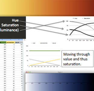
Color Mapping in VIS: Perspectives on Optimal Solutions [ Presentation ]
Samsel, Francesca
01.01.2015.
2013
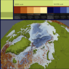
Art-Science-Collaborations: Examine the Spectrum [ Inproceedings ]
Samsel, Francesca
VISAP IEEE Vis 2013, 2013.
Collaborations between artists, visualization specialists and scientists produce a broad range of outcomes. They vary widely in purpose, scope and form. Being familiar with the range of possibilities as well as understanding the vocabulary and processes of the respective disciplines facilitates the process. The collaboration process ranges from artists assisting with color maps and design decisions to scientists collaborating with artists on work designed to hang in a gallery. The outcomes often extend beyond the original intent. Visualization specialist and scientists speak of the surprising impacts on their work. Art and visualization both are exploratory processes as well as communication avenues. Collaborations between the three fields show the potential for outcomes from increasing understanding of science to discovering solutions to significant problems of our time.

